Uncovering the LabView XY Graph
The LabView XY Graph is a feature filled control that allows a well informed user access to any data point, and tailored image capture for a report.
When you become aware of these features, you will be given more access to the data being plotted than is often even intended by the programmer. This is because by default three major controls are hidden.
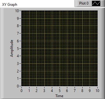
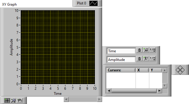
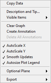
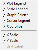
To unhide these features right-click on the graph and select the Visible Items sub-menu. Below is a quick summary of their function.
Plot Legend – Name and style each plot in Graph
Scale Legend – Style Grid and Set the X&Y axis Precision/Display
Graph Palette – Zoom in and maneuver graph
Cursor Legend – Create Cursors to interrogate plots in graph
X Scrollbar – Allows you to quickly scroll the plot in the X direction
X Scale & Y Scale – Editable numbers allow zoom and reversing of plots
The Plot Legend, Scale Legend, Graph Palette, Cursor Legend, and X Scale & Y Scale are detailed in the next 5 sections. The last Section details Image Capture through the Copy Data and Export options.

The Optional Plane option adds additional lines to the grid in the graph depending on the item selected. I have yet to make use of this option since it is very data dependent. I also caution against using it since I have experienced LabView hang when selecting the Nichols option.

The plot legend allows you to hide or show individual plots, change the color of a plot, show the points in a plot, interpolate with lines between the points on a plot, change the size of the points or thickness of the lines on a plot, fill the space between two different plots, change a plot to a bar graph, and export an individual plot to the clipboard.

The scale legend consists of 1 text control and 3 buttons for each axis. The top row is for the x axis and the bottom is for the y axis.
The text control allows you to change the names for either axis.
The first button with a pad-lock allows you to turn on/off the auto-scale option for either axis. When this option is on the little green light over the second button is a light green as pictured rather than a dark green.
The second button is for momentarily auto-scaling the X or Y axis. This button is pictured with little x-y-z axis and an X or Y letter where the corresponding axis is slightly thicker in the picture.
The third button allows you to set the precision of a given axis and how it is displayed. This is not purely visual, because it also effects the data precision when exporting to the clipboard and excel.
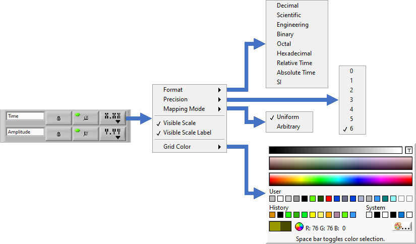
When choosing the Grid Color there is a color option for the major and minor grid lines. To select between these you push the space bar. By default both the major and minor grids are changed at the same time. The “T” in the upper right corner is for Transparent.
The video below demos scale Legend options.

The graph palette allows you to zoom in and maneuver to specific places in the graph.
When zoomed in to a limited region of the graph, the exported data is limited to this region.
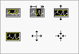
The Magnifying Glass button has six options. Starting from left to right and top to bottom.


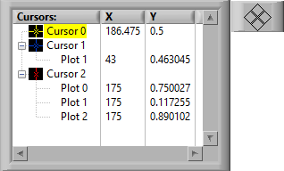
The Cursor Legend is useful for probing specific points in the XY Graph.
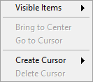

You can create 3 cursor types namely Free, Single-Plot, and Multi-Plot.
The Free cursor reports a value anywhere in the drag the cursor in the plot.
The Single-Plot cursor stick to a single plot.
The Multi-Plot cursor displays the Y values for a given X value for multiple plots.
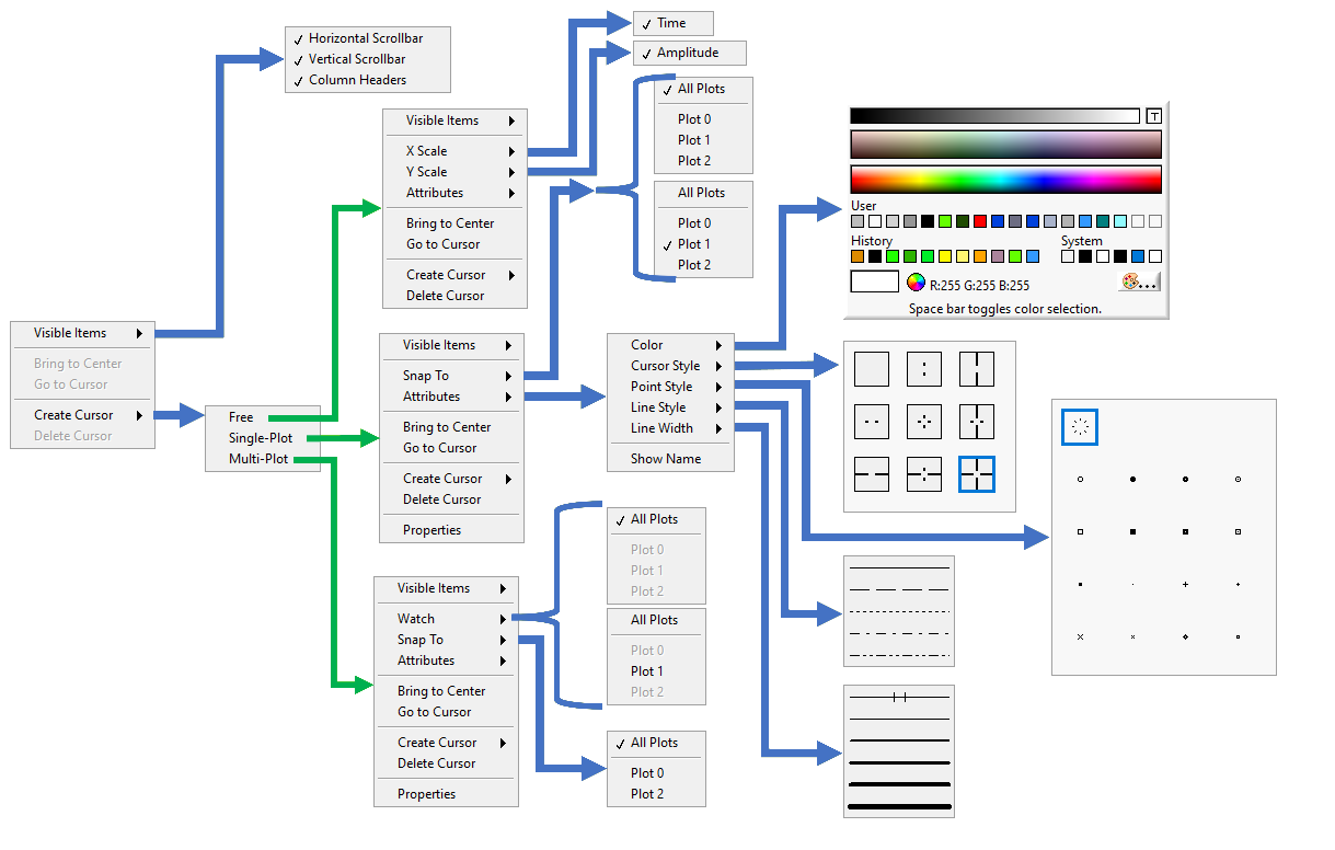
The exploded right-click menu for the cursor control is displayed above. When exploring these controls, I found a bug associated with the Multi-Plot cursor. Basically if you manually select all the plots to watch you can never de-select them, unless you delete this cursor and re-create it.
The video below demonstrates the use of these options.
The X and Y scales on allow you to edit their values when you click on them.
This allows you to manually zoom in to specific data ranges, and reverse the way in which the data is plotted.

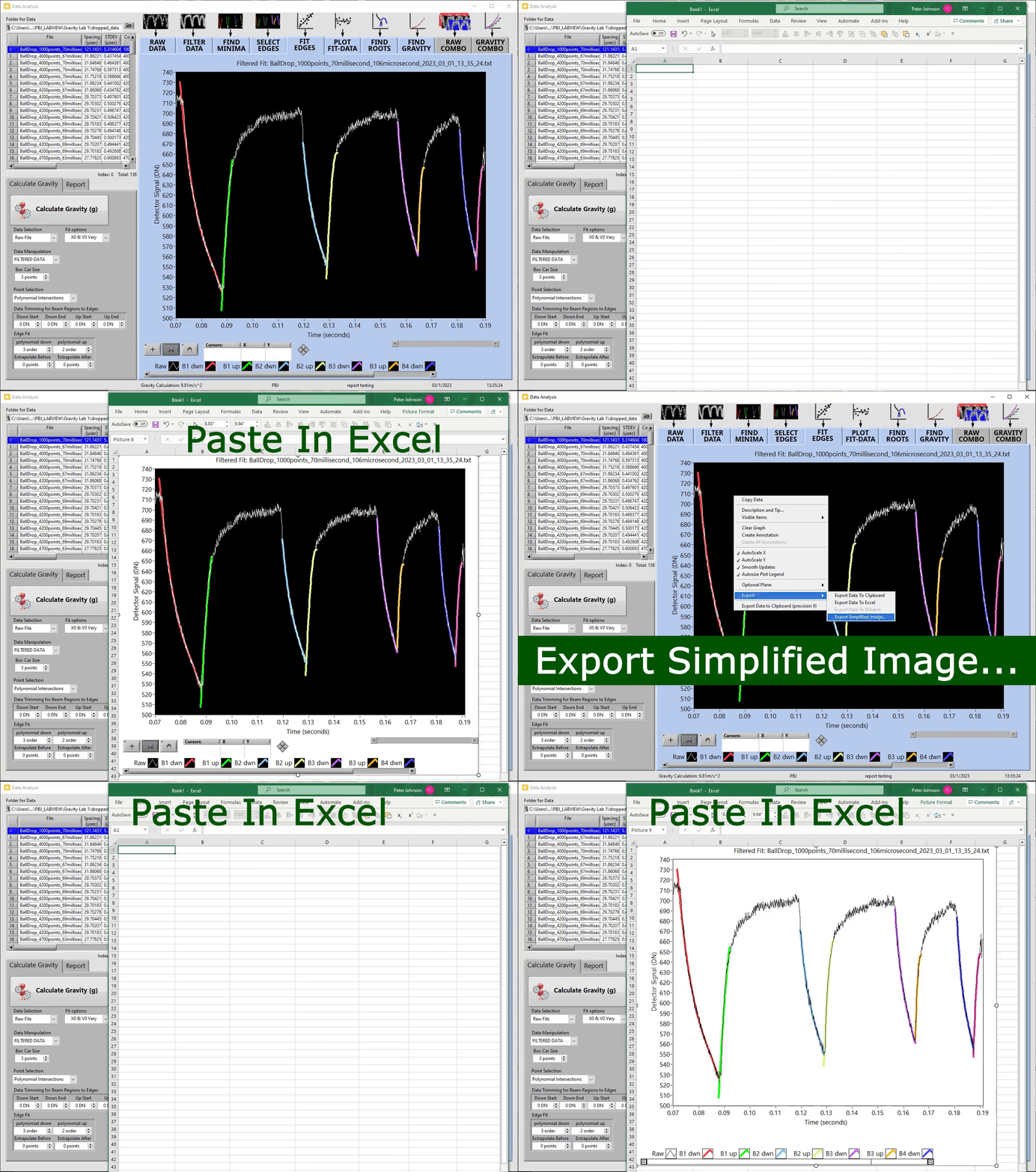
There are two right-click options for exporting the XY Graph to an image rather than using a screen shot tool.
The Copy Data right-click option copies the entire XY Graph as you see it including the Graph Palette, Cursor Legend, X Scrollbar and Scale Legend, if they are visible.
The Export –>Export Simplified Image creates an image with a white background without the Graph Palette, Cursor Legend, X scrollbar and Scale Legend.
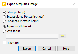
This option allows you to export the image as Bitmap(.bmp), Encapsulated Postscript(.eps), & Enhanced Metafile(.emf).
Finally, this option allows you to save this image to a file, and hide the grid on the plot if there is one being displayed.
The GIF image below shows the results of these two options when they are pasted into excel using the short-cut past option of CTRL+V
